
Brave, braver, bravest
How an architecture firm learned to speak from a place of fearlessness
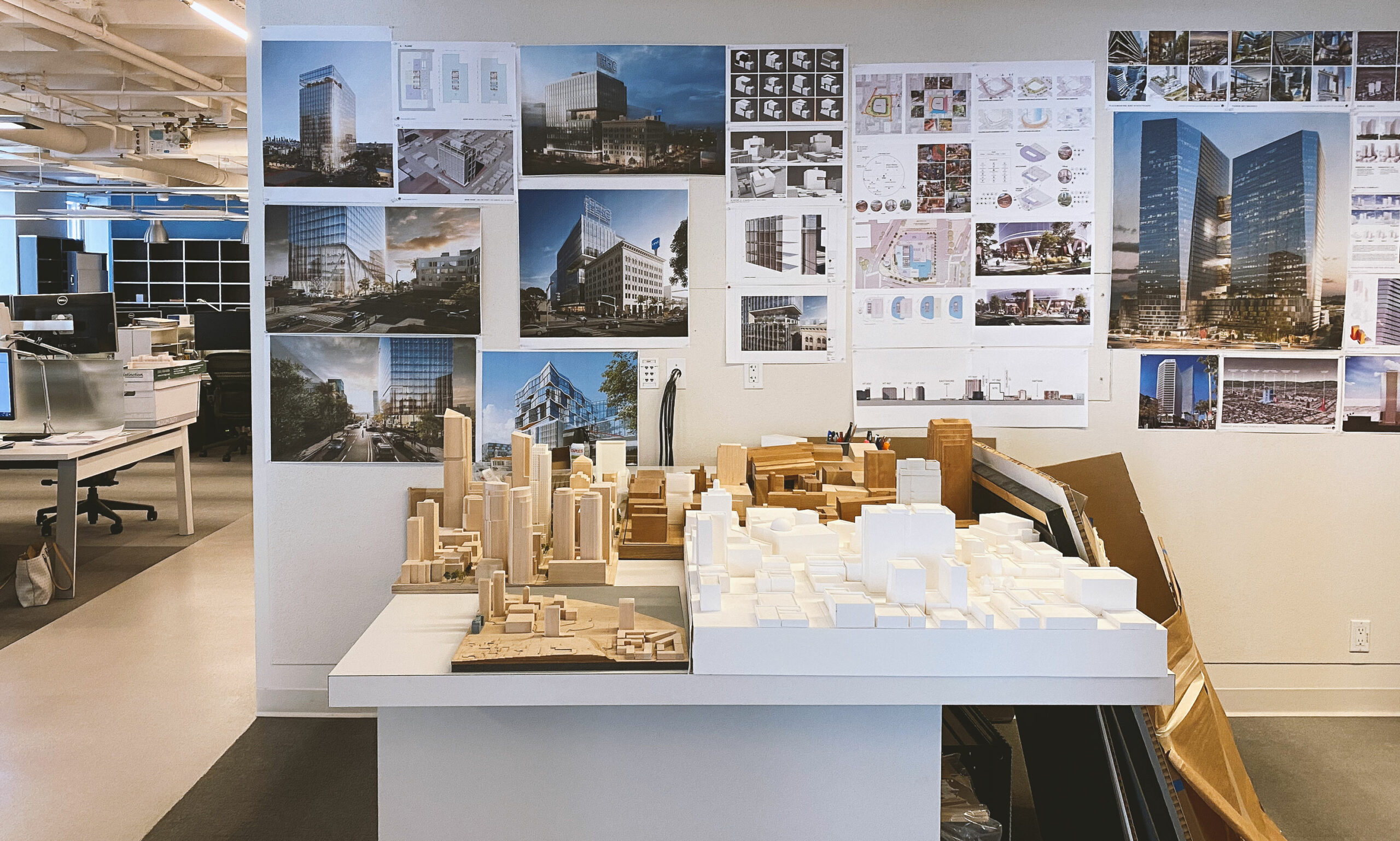
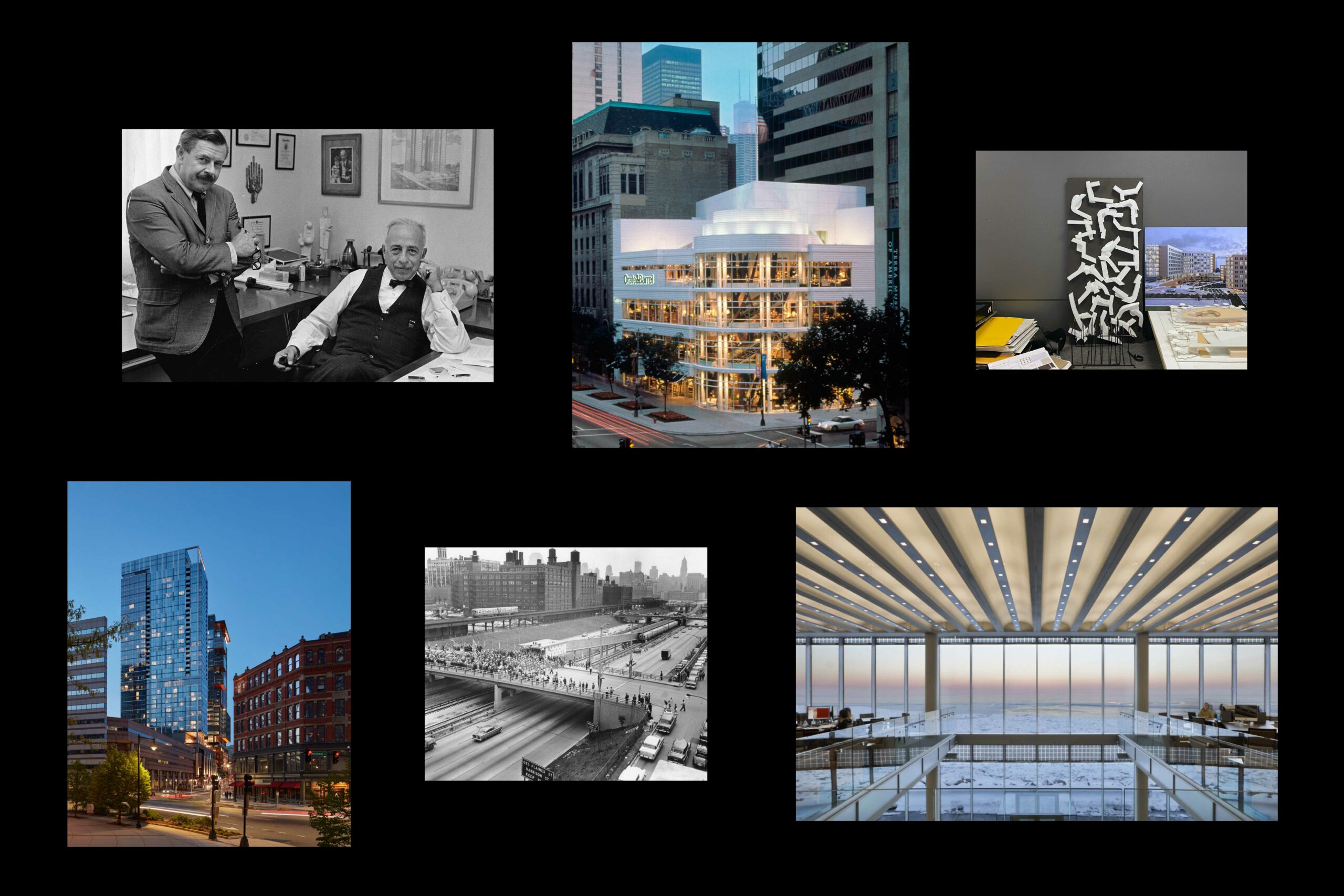
SCB’s origins are the stuff of mythology. Its namesakes made daring bets in the Great Depression, fought in the skies during World War II, and invented a new way of living in modern cities. It advanced bold urban ideas in an era of suburban flight. It managed to combine imaginative design with meticulous attention to the human scale of everyday life. In its ninety-plus years, SCB expanded to four offices throughout the US that continue to shape transportation infrastructures, university campuses, and city living. Yet there was a sense that the firm’s unassuming, Midwestern-inflected work ethos was preventing SCB from fully celebrating its impact. As it matured and grew, SCB had become too humble.
So humble, in fact, that even the firm’s name was in question: should it continue to pay homage to its namesakes, Solomon, Cordwell, and Buenz? Or should it embrace the muscular moniker SCB? Working with the national leadership of the firm, Ummo facilitated a yearlong branding process aimed at uncovering SCB’s strengths, articulating its thought leadership, and clarifying its identity.
In initial conversations with firm leadership, staff, and clients, we saw the disconnect between SCB’s extraordinary body of work and its unassuming, at times hesitating, tone of voice. And we agreed that while humility was endearing, the firm also needed to cultivate a confident posture.
“We stand proud of where we have come from and even more inspired about where we will go.”
Through multiple town-hall style meetings and in intense dialogues with design leaders, we drafted a set of values that sought a balance between confidence and understatement. The values statement reads, in part: “We believe in big ideas over big egos… in an ethos of hard work and open minds.”
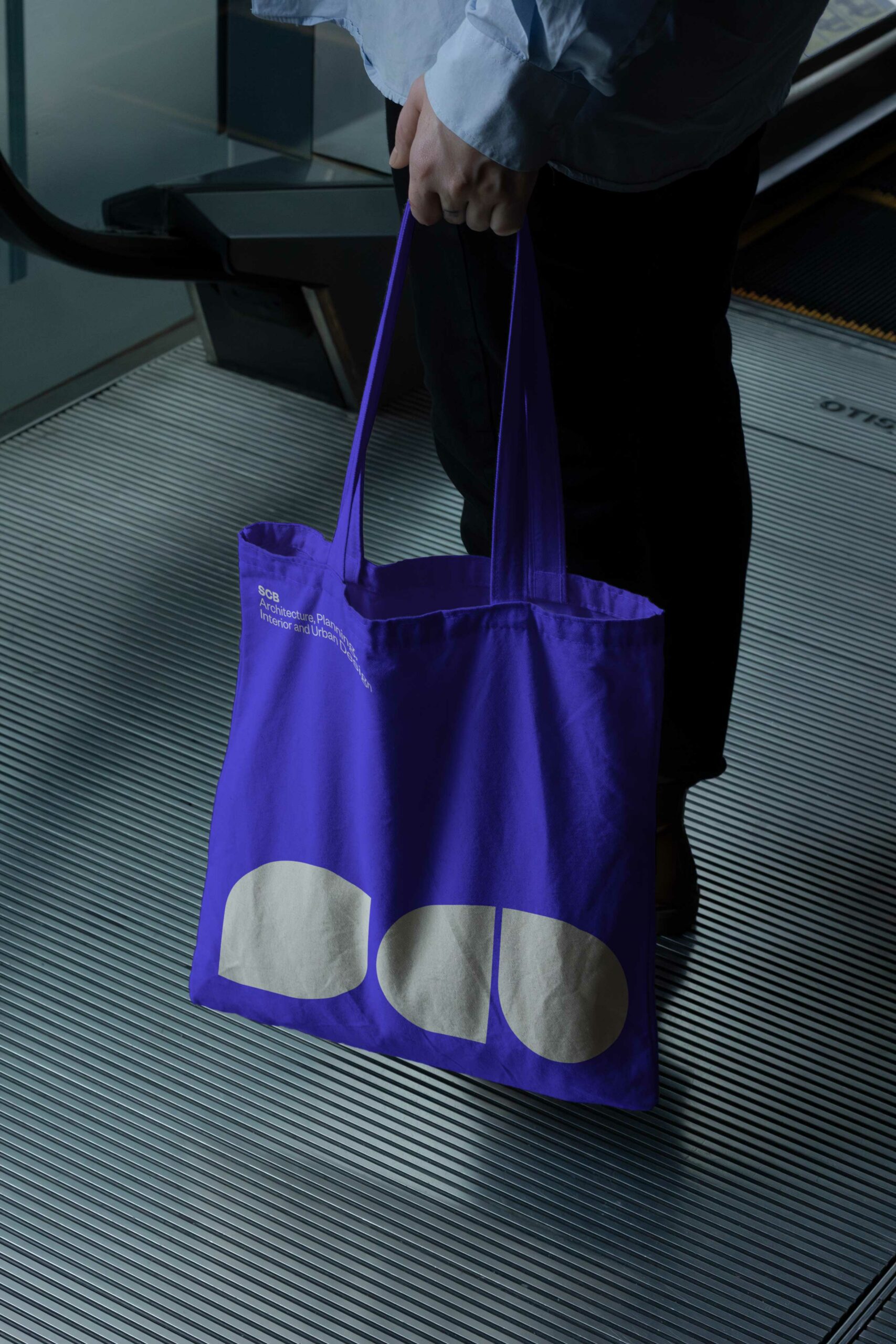
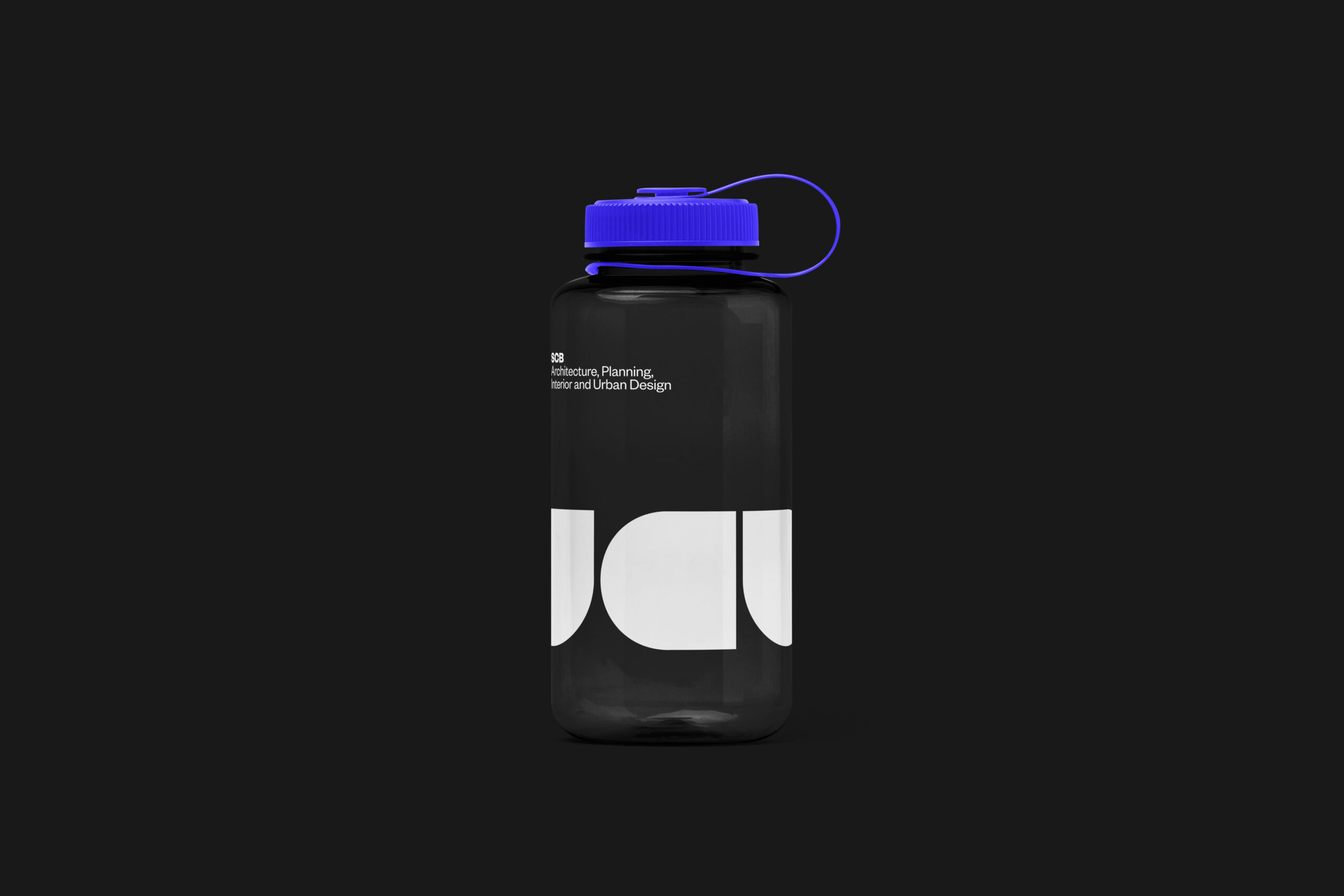
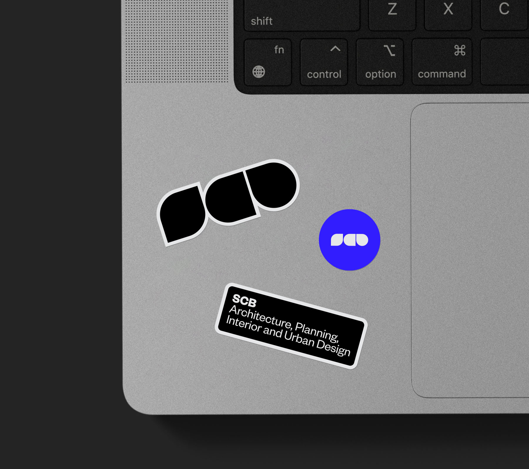
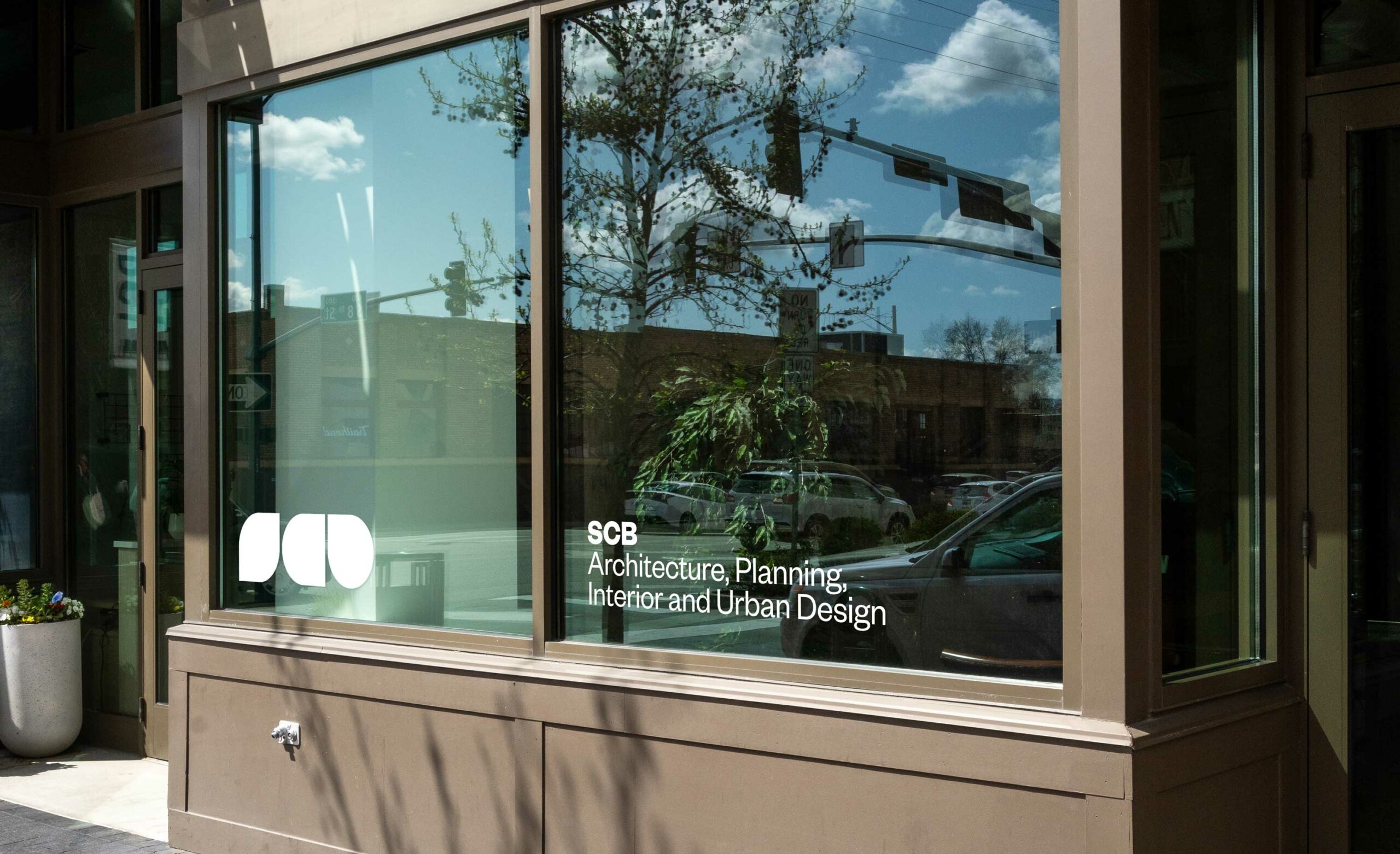
Ummo’s approach to the brand could be summed up as “Be brave.” The new logo mark telegraphs this approach. The mark is intentionally abstracted; its purpose is to make an impression, not to be universally legible. It was derived by reducing complex letter forms into the most fundamental geometric constructs: a square and a circle. By overlapping those geometries, three abstracted shapes—suggestive of S, C, and B—emerged. These shapes, brave and confident, are foundational to the voice of the SCB brand. The elemental shapes of the logo also serve as abstract containers for placing project photographs or filling with color and texture.
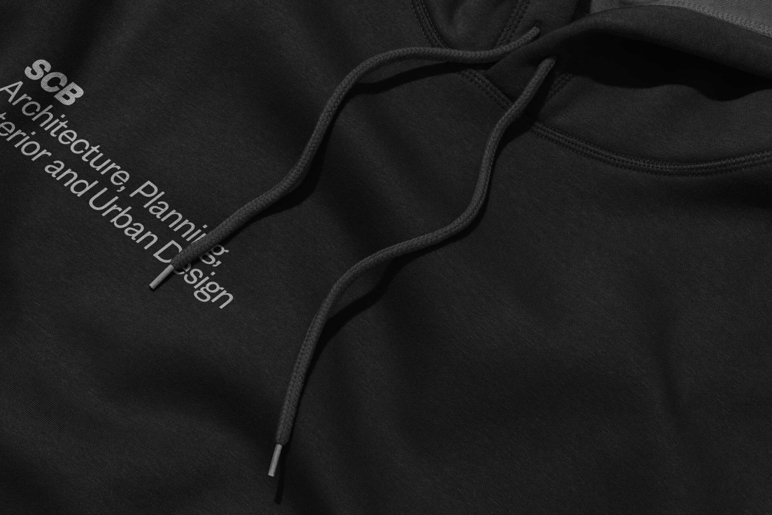
The primary mark is supported by a full typographic suite, with letterforms that are crisp, yet highly crafted. The primary color palette makes a minimalistic gesture: only an electric blue complements black, gray, and white. (Notably, an expanded secondary palette gives designers plenty of options for renderings and proposals.)
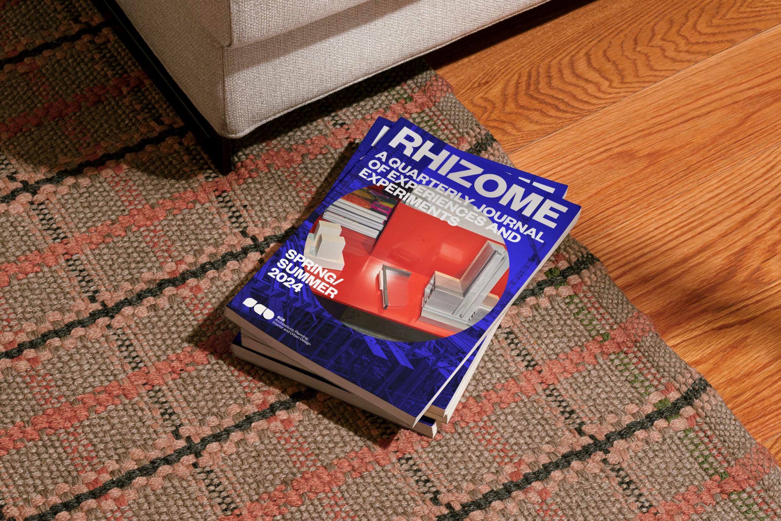
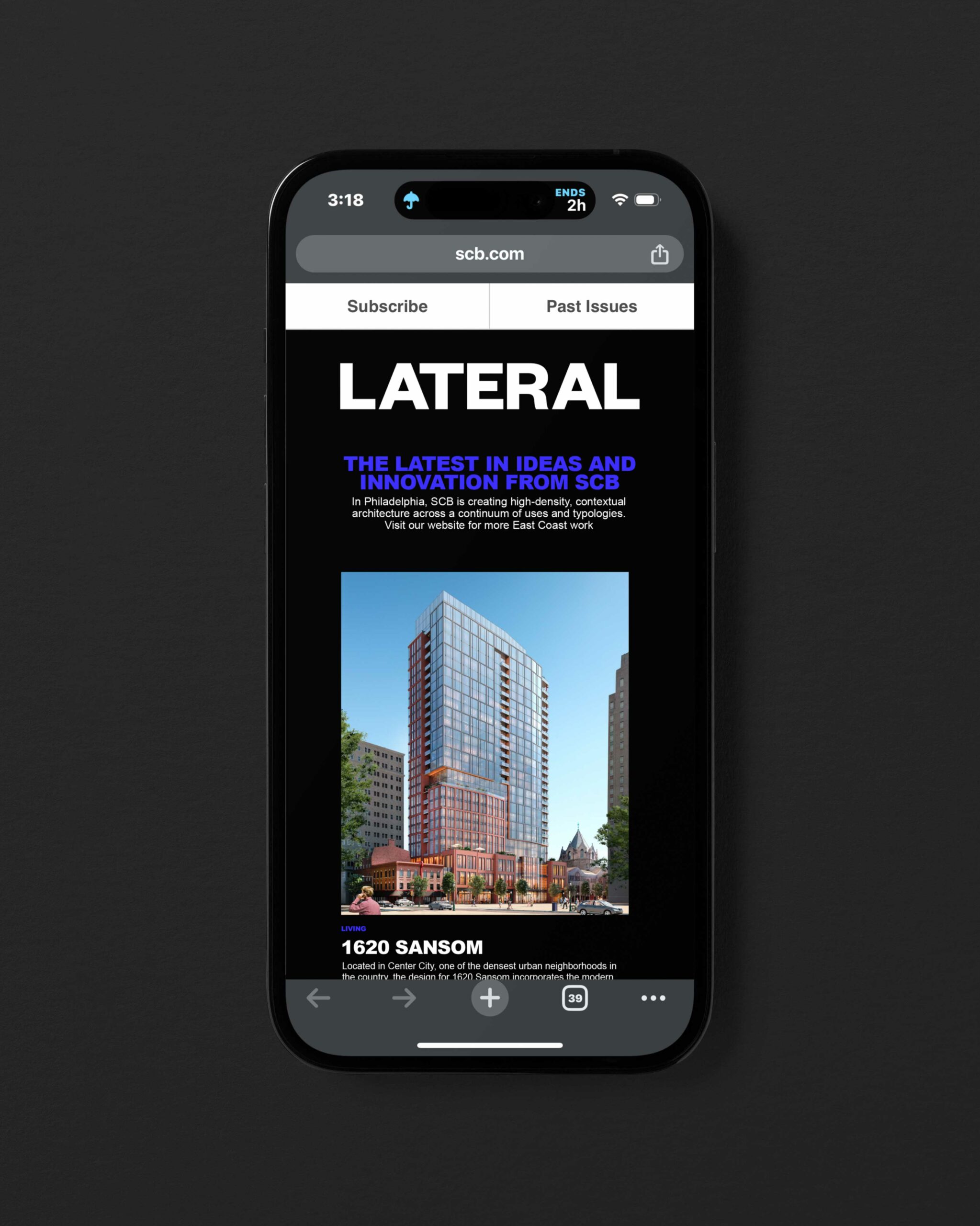
Literally and laterally—SCB’s founders were fond of invoking lateral thinking as a way to solve tricky design problems. A new thought-leadership publication pays homage to those heady days.
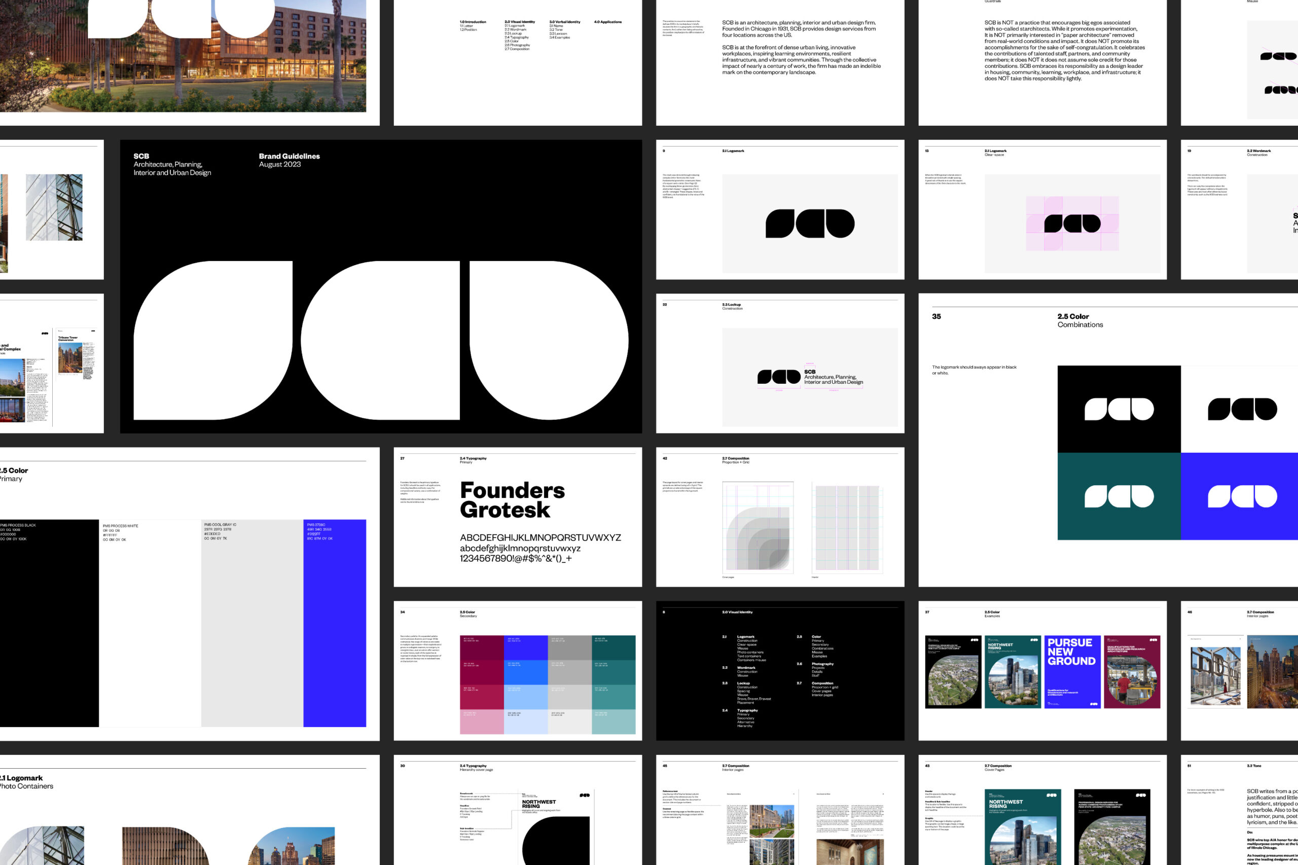
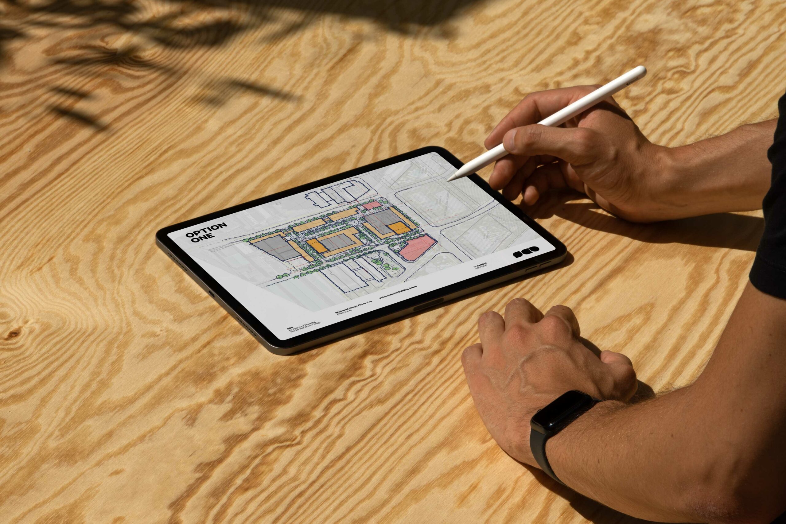
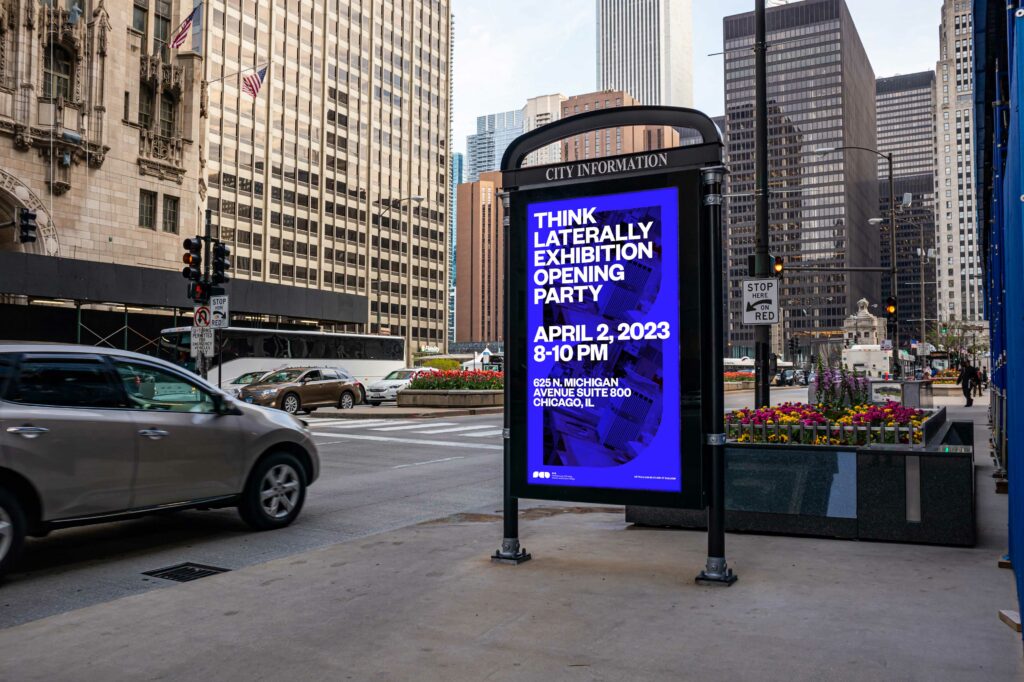
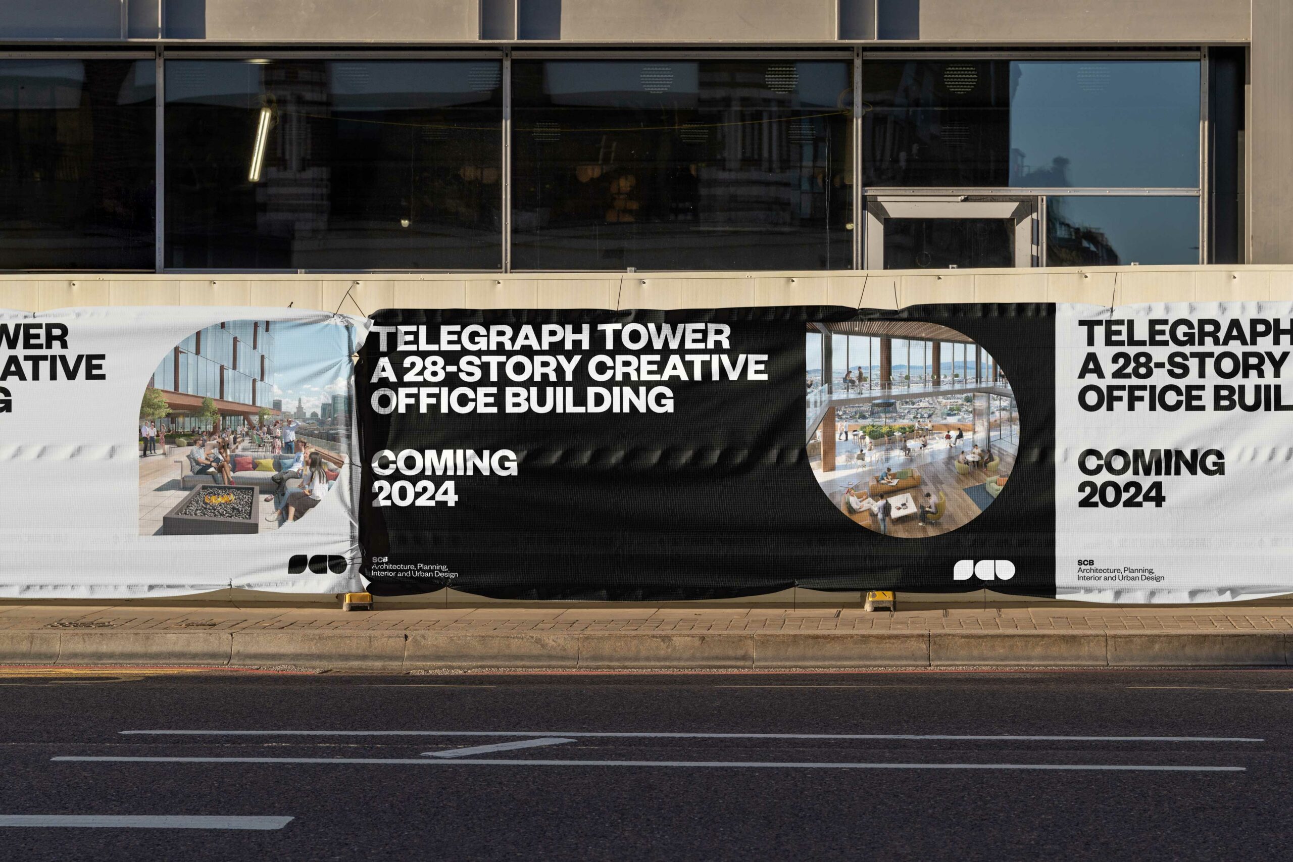
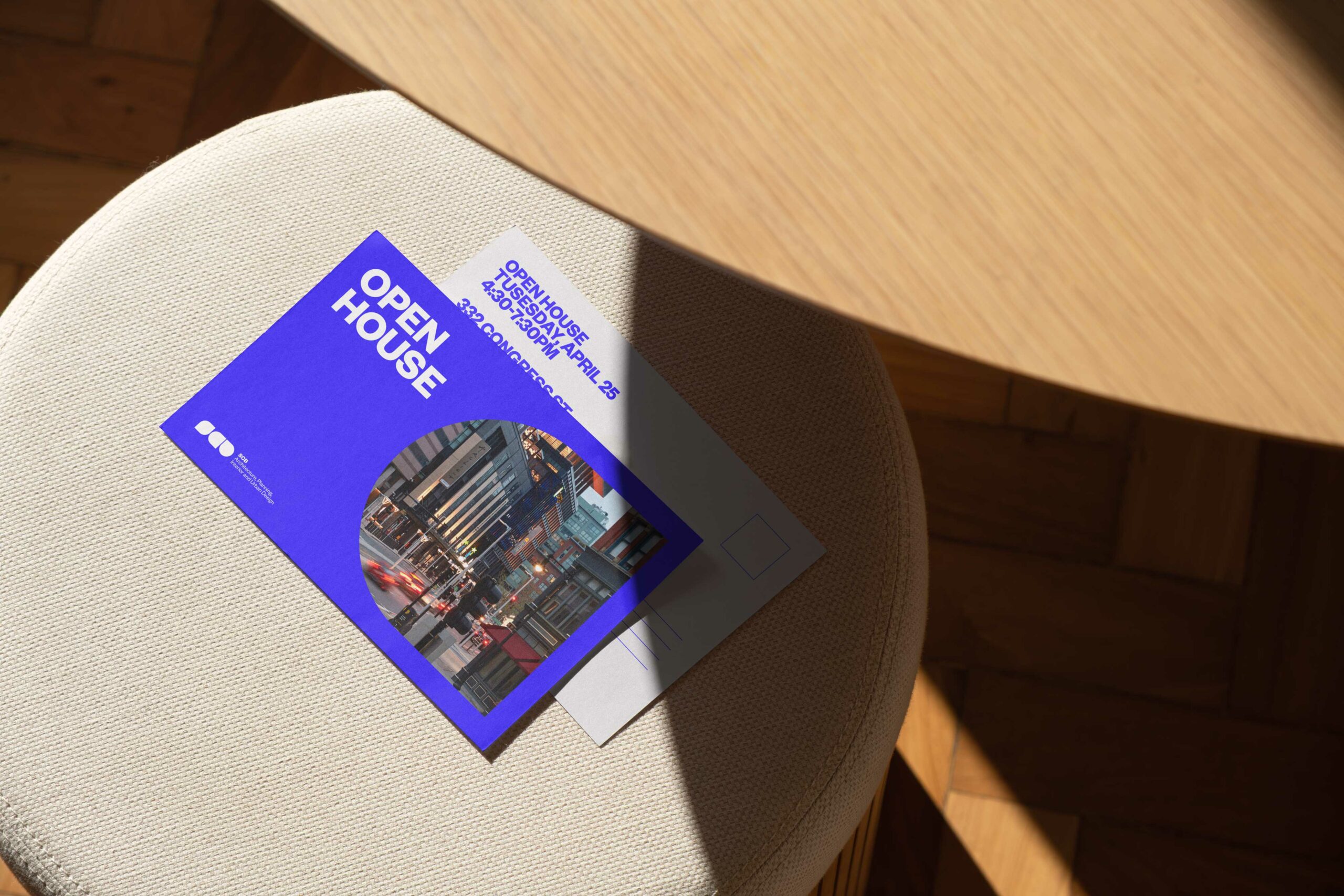
A comprehensive branding suite includes editorial guidelines whose vocabulary commands direct, commonly-used words. It offers guidelines regarding photography that places the firm’s work into urban context. It also addresses the workhorse materials of an architectural practice: layouts for materials that range from presentation slides to proposal covers to postcards.
A year later, SCB communicates from a position of expertise which requires no justification or embellishment. Across the firm’s offices and practice areas, it speaks with one voice—and uses the same name. And, at last, it honors its origin story.
Colophon
Project
Strategy, repositioning, and identity for SCB
Client
SCB
Scope
Typology
Yoga practice
Early in the design process, we knew that SCB needed to strike a stronger pose. But which pose? We nearly twisted ourselves into pretzels to find the answer: the classic Yogic asanas of Humble Warrior and Hero. This physical metaphor gave us space to imagine the future personality of SCB.
