
Architecture with ambition
How a young, woman-led practice burst onto the Chicago architectural scene
Like no other city in the world, Chicago is a laboratory of architecture. Here, reputations are made, legends are born, mettles are tested. In this heady environment, the stakes are high for a new architecture firm. But when an ambitious, young team of Chicago-based architects approached Ummo to help them forge a new identity—including a name—there was never any doubt about their success.
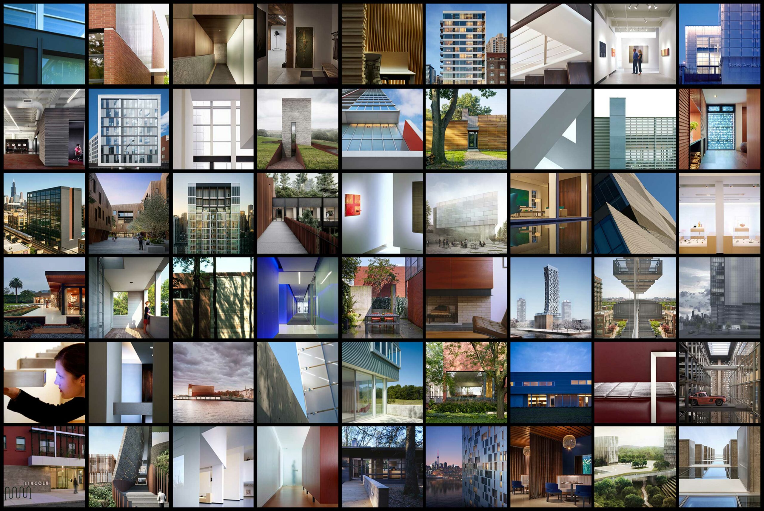
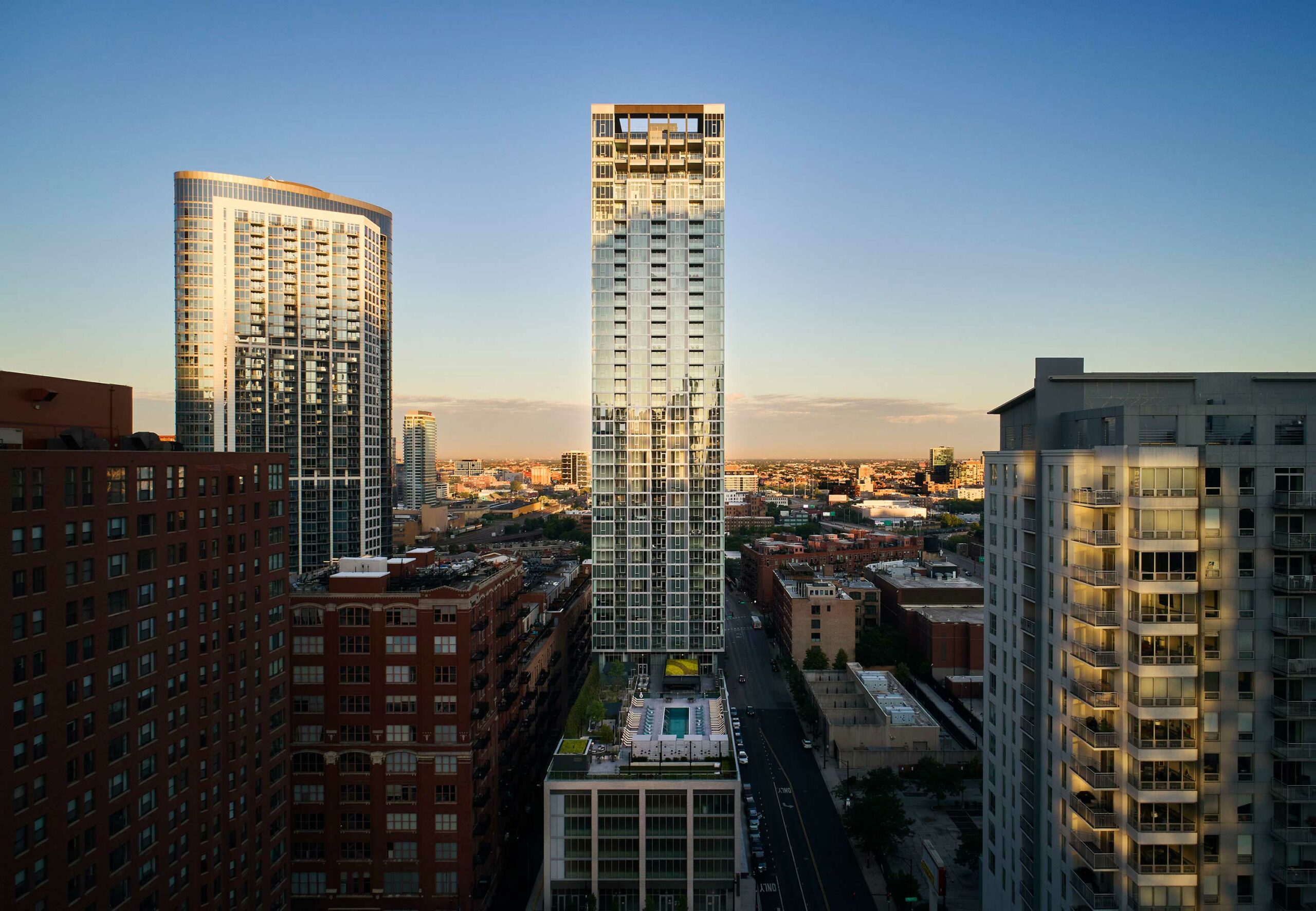
Founded by architects Jen Park and Brad Fowler, the multidisciplinary design studio is based in Chicago but has an international footprint. It is rooted in a storied legacy of Chicago modernism: Park and Fowler were previously partners at a significant architectural practice, where they led a portfolio of award-winning projects. They tasked Ummo with creating a visual and editorial identity that both honored the Chicago tradition that came before them—and signaled a break with tradition.
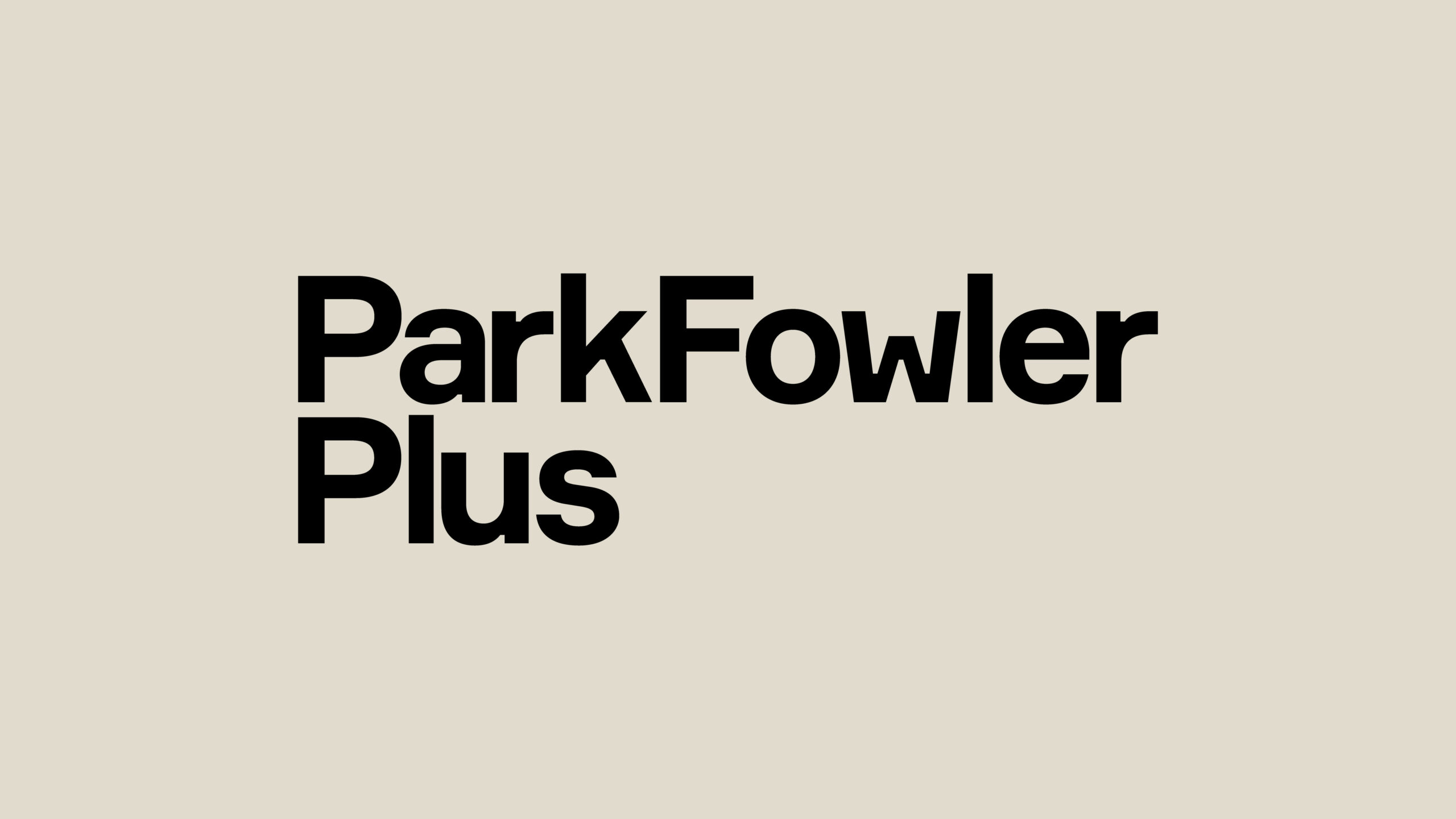
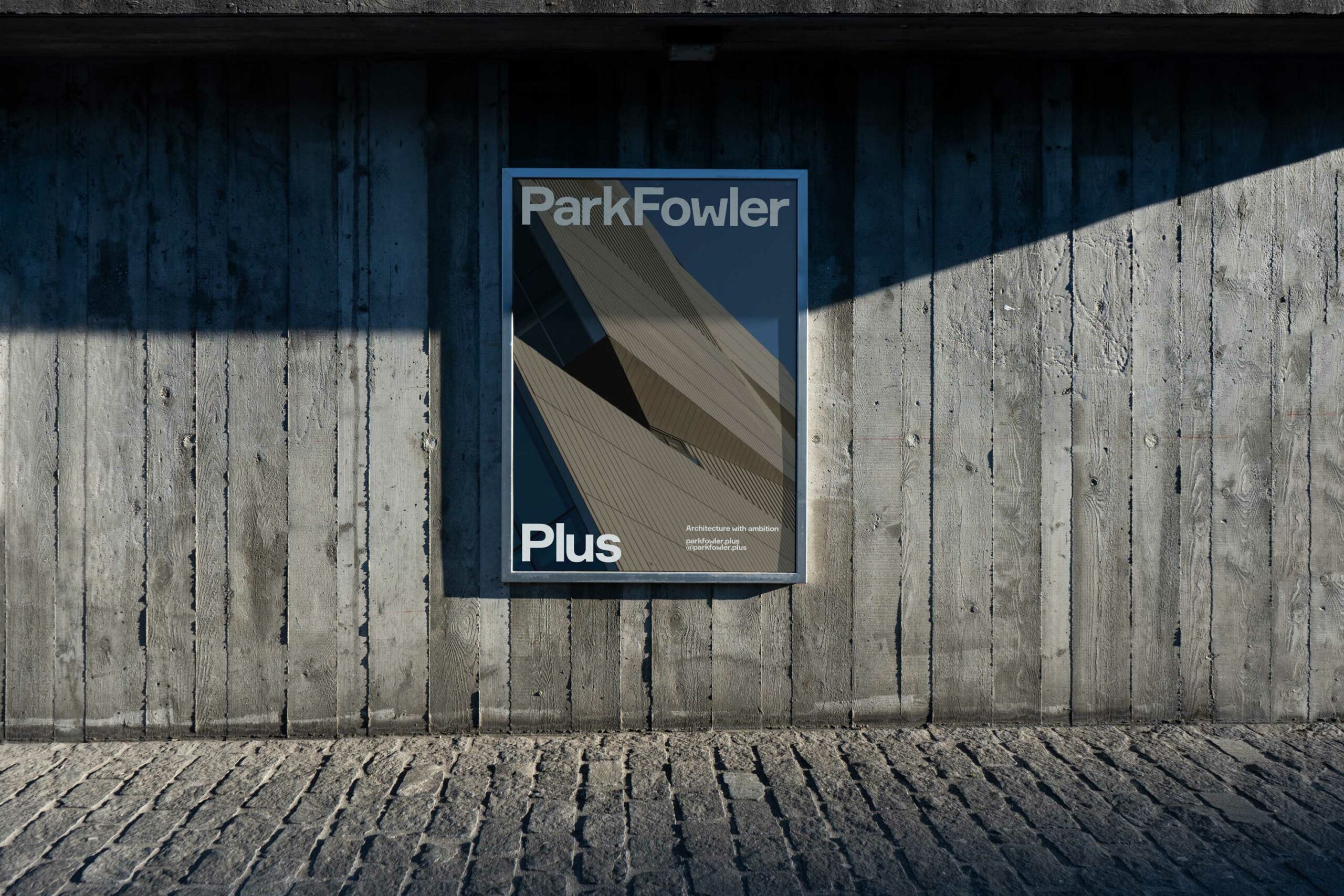
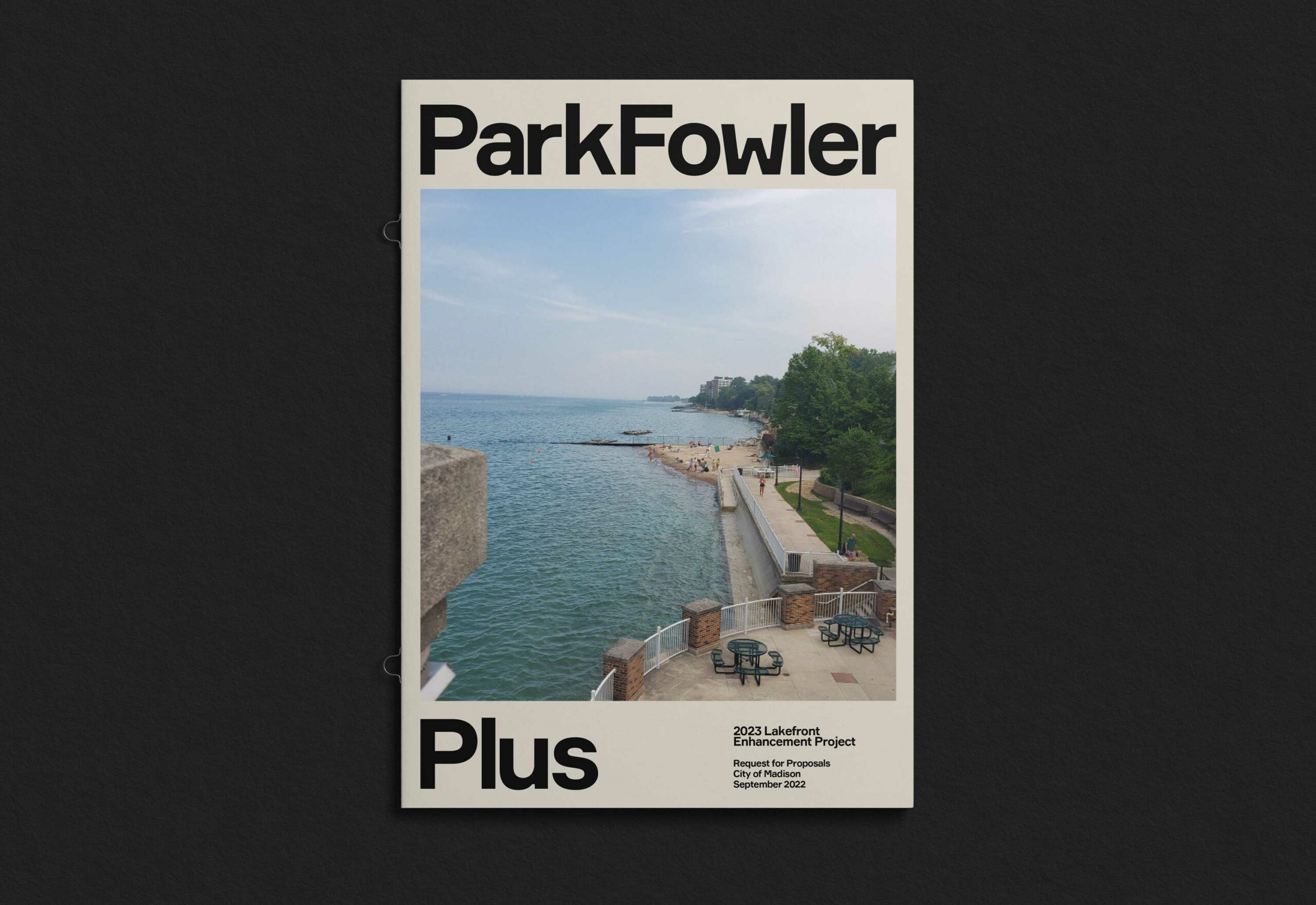
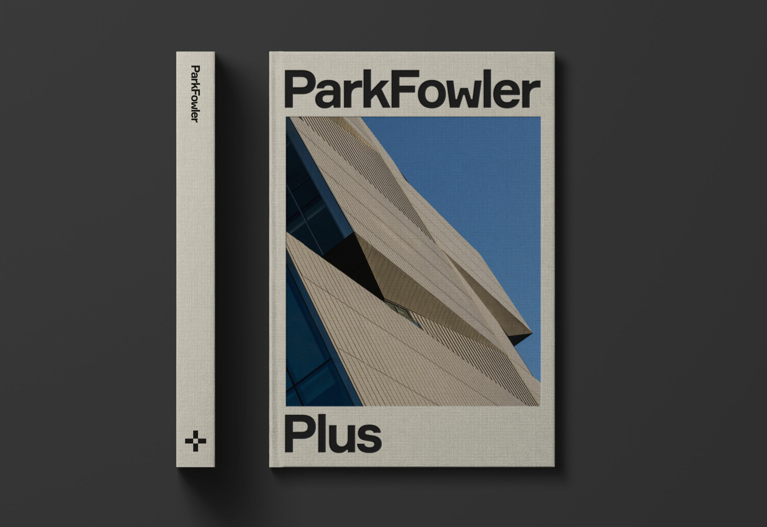
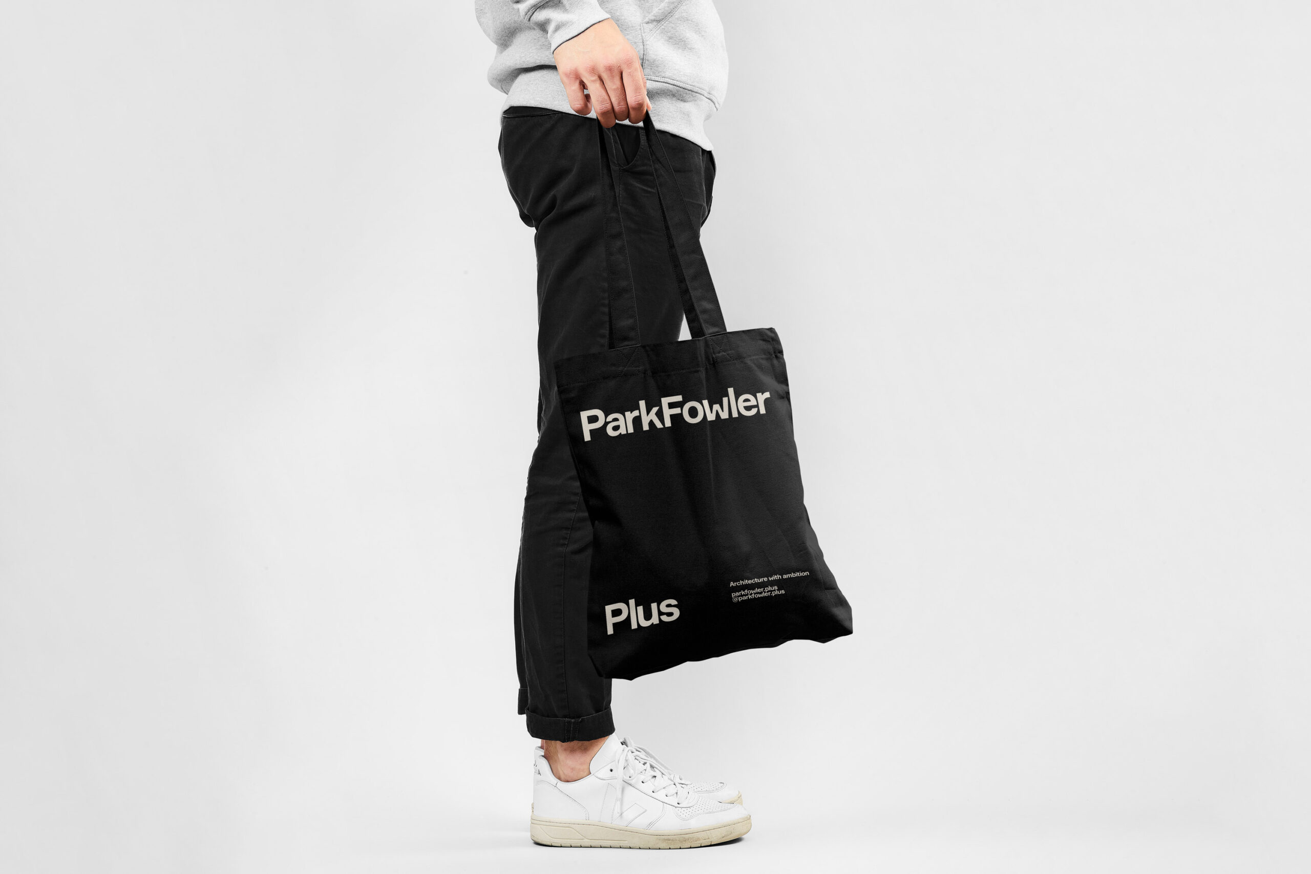
To get the new firm quickly to market, we worked with Park, Fowler, and their team closely and collaboratively. We rapidly prototyped ideas, reviewed precedents, and held late-night writing sessions. The name, ParkFowler Plus, introduced the founding partners and simultaneously suggested a broader team and scope. The editorial strategy—confident, jargon-free, and aspirational—elaborated on that theme.
“As a woman-led, diverse, and experienced team, our energy level is extraordinary. We see an opportunity to lead our field forward, and to reimagine what design can do for
communities.”
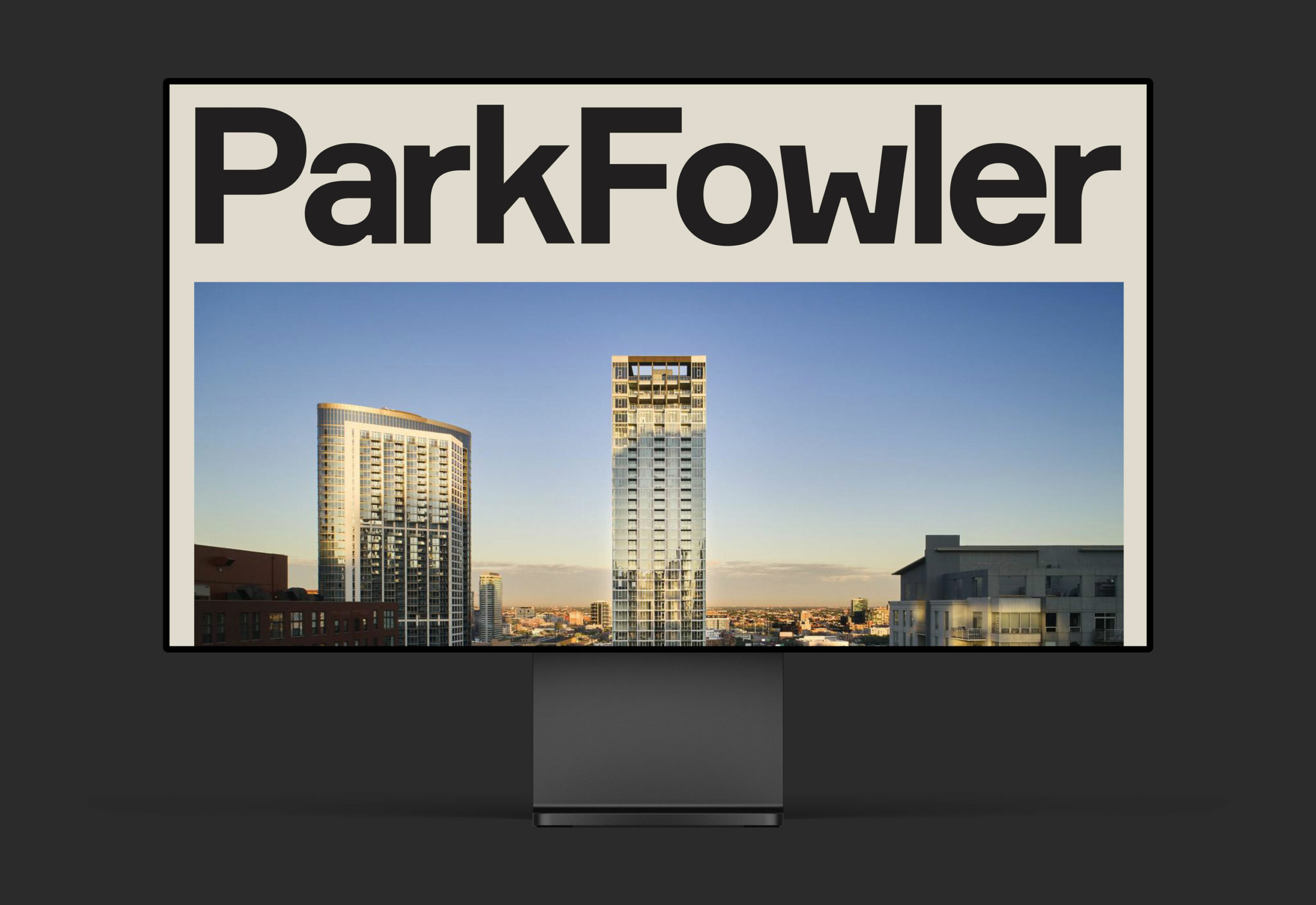
Visually, ParkFowler Plus strikes a similar balance between tradition and disruption. The mark, featuring prominent ink traps in the typography, alludes to Chicago’s long history of type foundries and bookmaking. Yet it feels entirely of the moment, youthful and intentional. In addition to the wordmark, we crafted a secondary plus symbol, which is used in social media and other applications. The plus mark adds a layer to the visual identity and, like other elements, is at once familiar and unexpected.


Formular type family by Brownfox
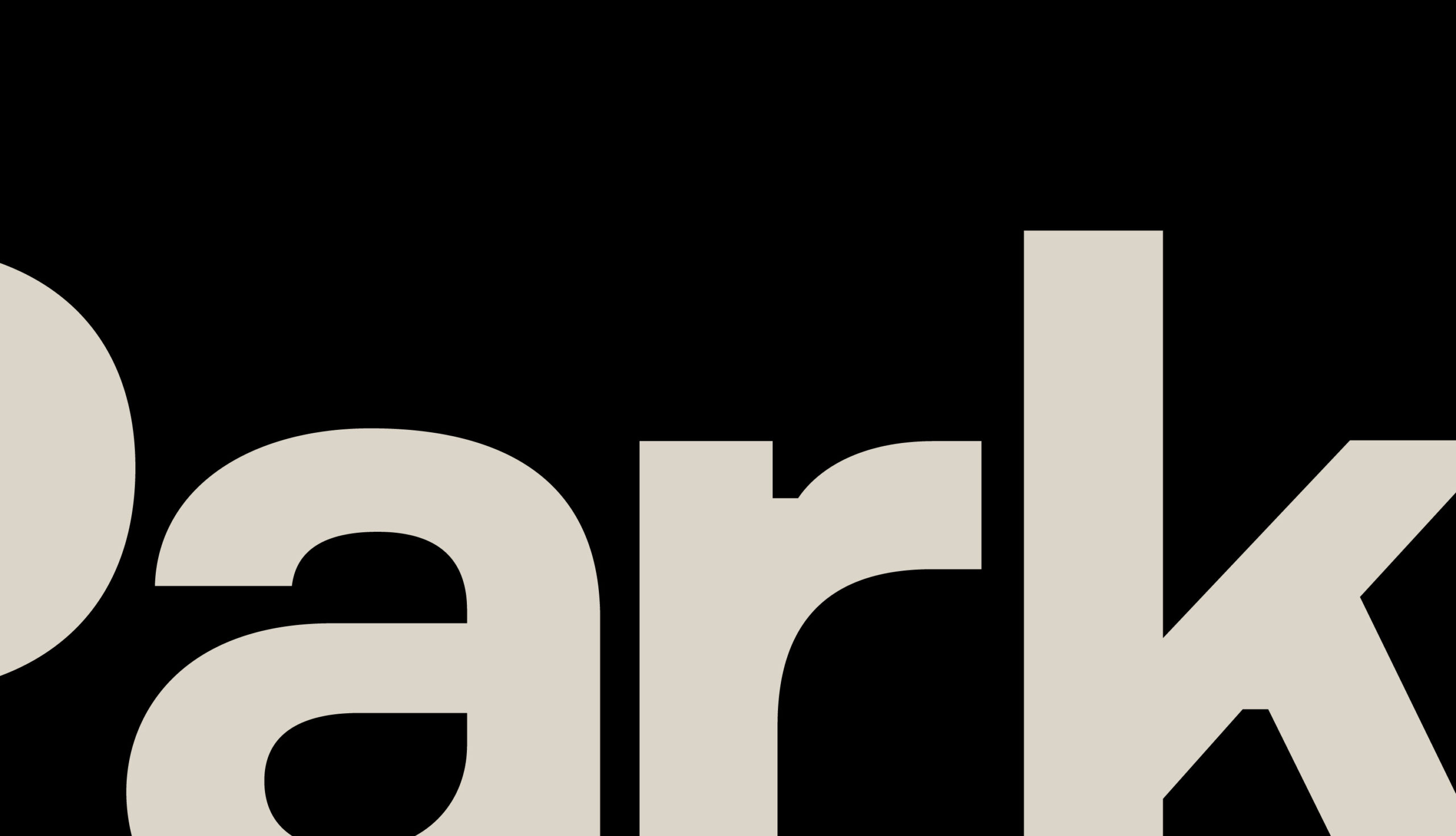
It’s a trap—characters in the Formular alphabet are accented by ink traps, which would have been common in Chicago typography in a bygone era of printing presses


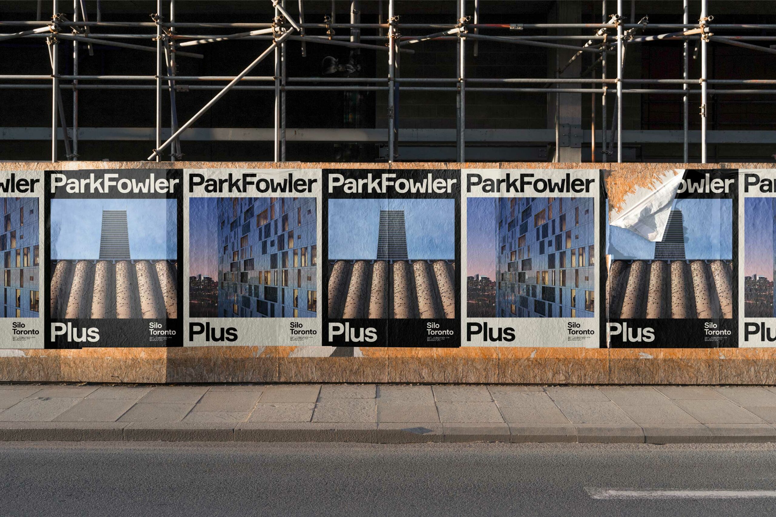
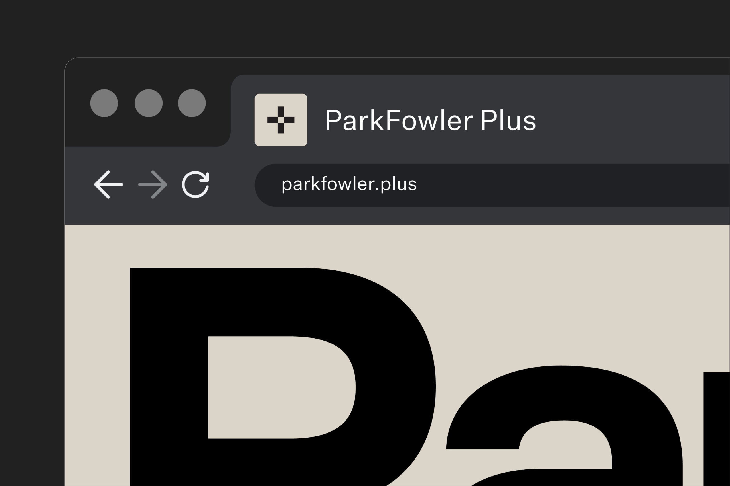
Our team designed and deployed a temporary website in record time, which brings multiple facets of the brand together. Its taupe background draws attention to stunning photographs and assertive typography, while subtle behavior cues lend to a sophisticated user experience. Given the firm’s roster of high-end institutional clients, the website experience is reminiscent of a contemporary art gallery.
The launch of ParkFowler Plus was covered by national design press and welcomed by industry peers. Even in the rarefied air of Chicago’s architectural elite, ParkFowler felt like a fresh breath.
Colophon
Project
Strategy and brand for ParkFowler Plus
Client
ParkFowler Plus
A most affectionate misanthrope
Architect Brad Lynch, who died in 2022, carried on a lifelong passionate affair with architecture. His firm was a storied testing ground for young, ambitious designers—including Park and Fowler. Ummo’s Philip Barash wrote a tribute to Lynch’s life.