Branding a boutique
How a bespoke approach distinguished an architecture practice

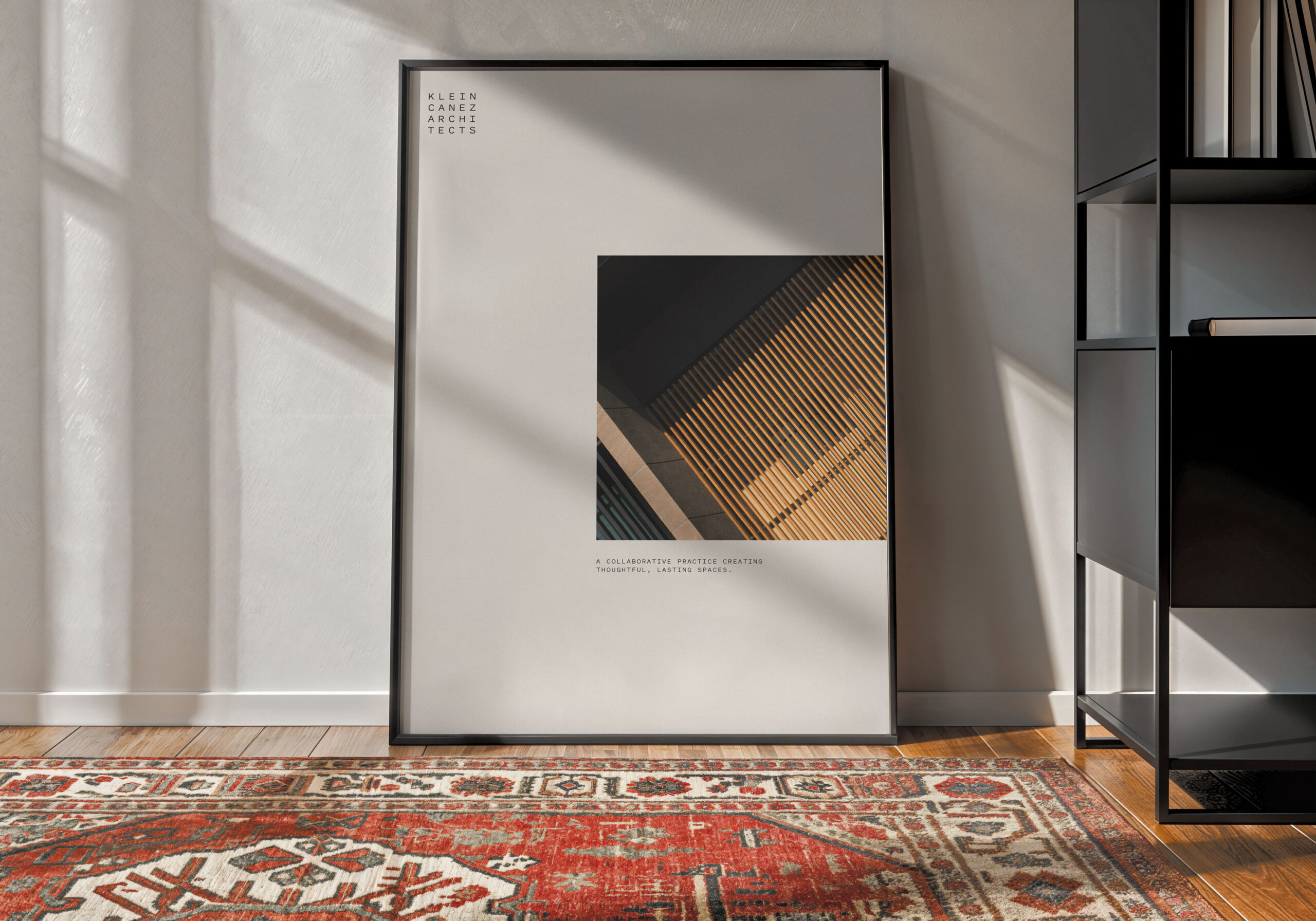
High-end residential studio Klein Canez Architects has carved a unique niche in the Houston marketplace. It offers contemporary design for discerning clients who demand rigor in every detail—from shading and joinery to spatial flow and finishes. The firm’s new brand needed to reflect the unrelenting rigor of the process, without losing sight of elegance and poetry of the final product.

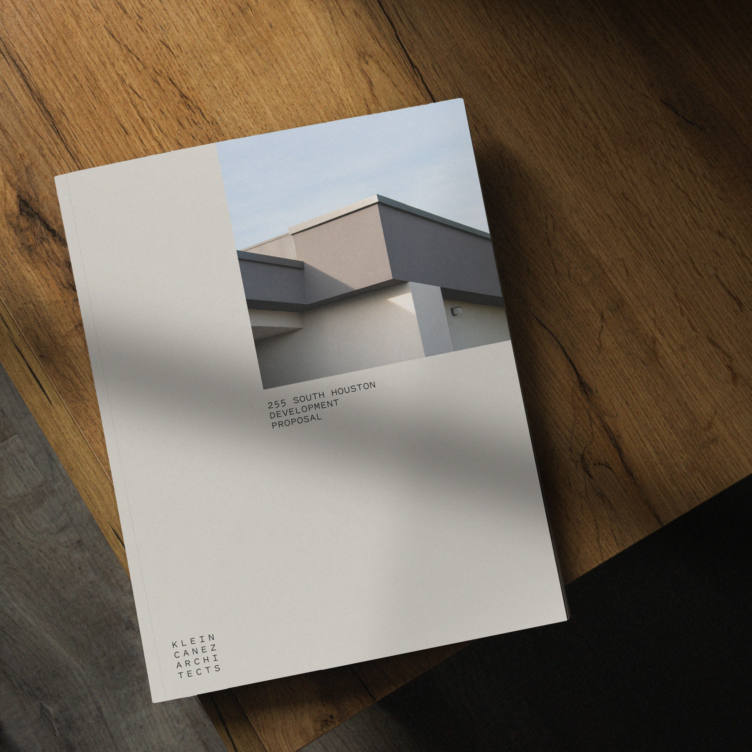
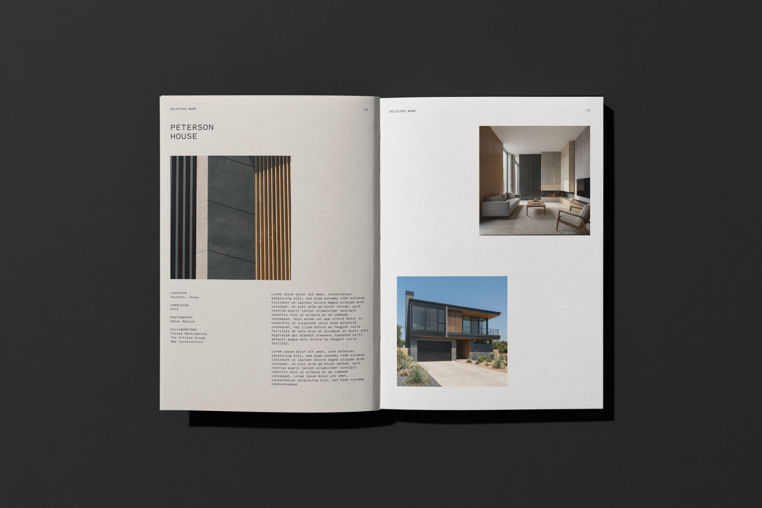
Ummo’s bespoke branding approach walks the line between tectonics and poetics. Klein Canez knew that its brand needed to deliver a first impression as a boutique studio—restrained and refined. At the same time, the finished architectural work also needed to speak strongly for itself, through photographs, models, and drawings.
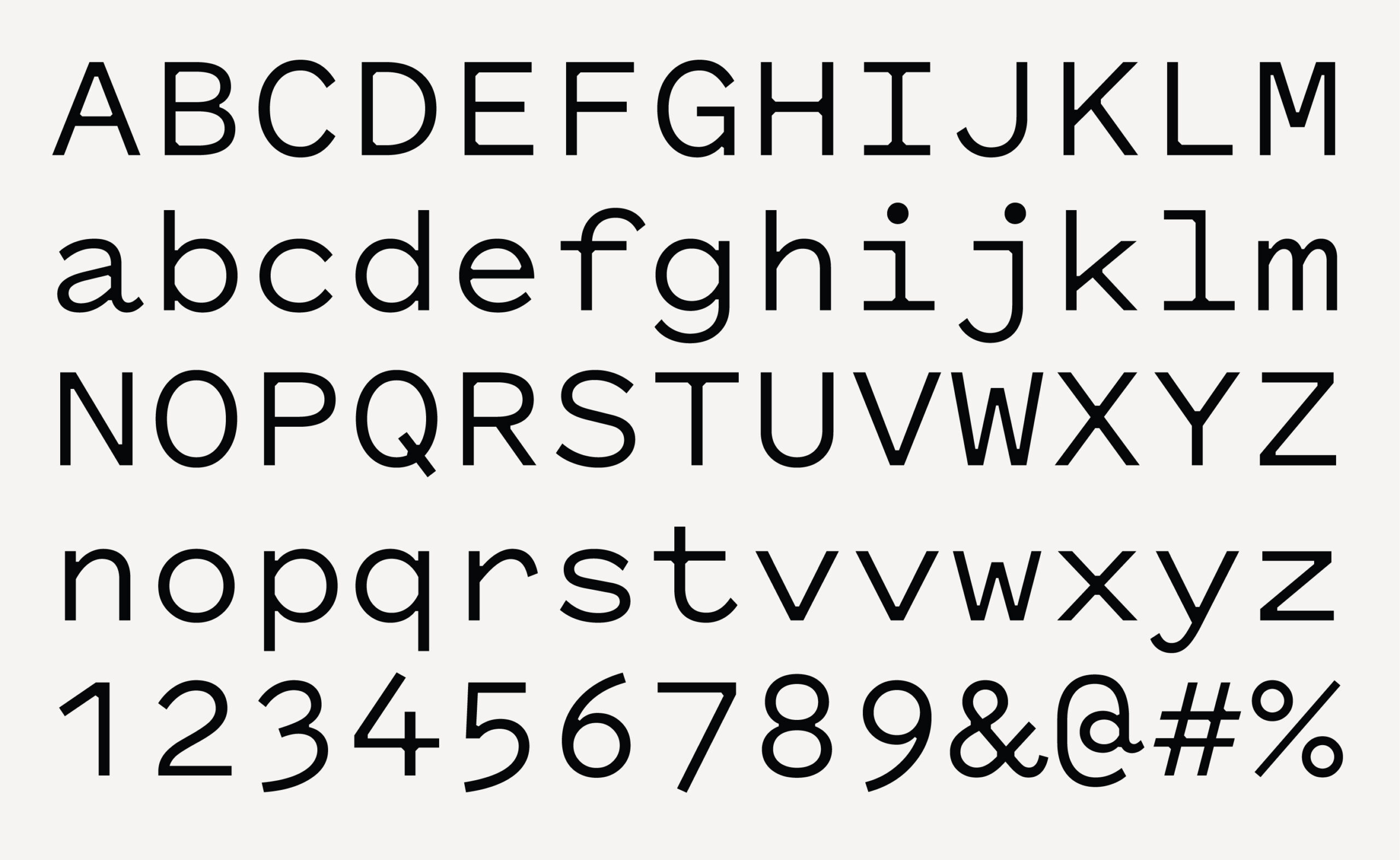
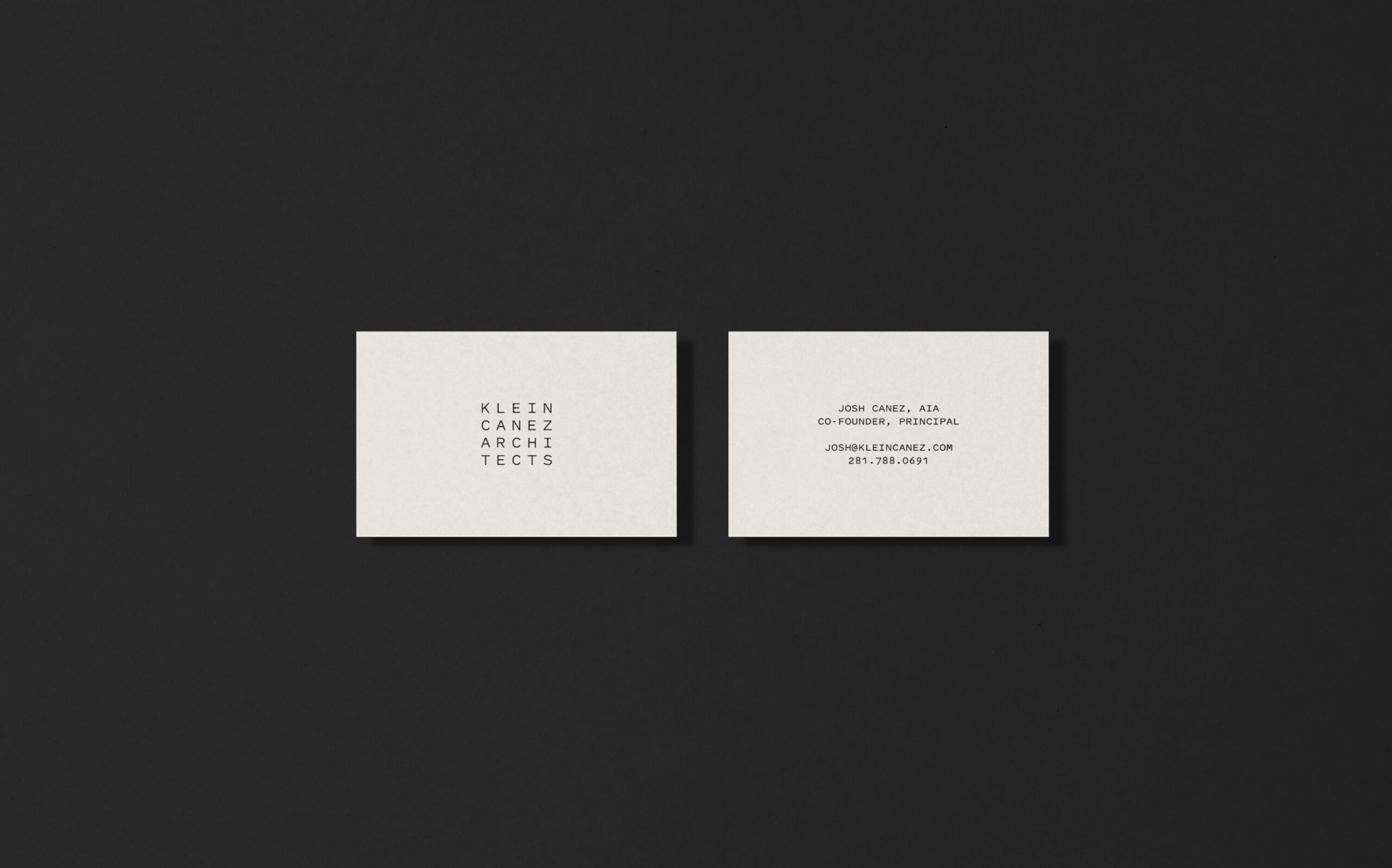
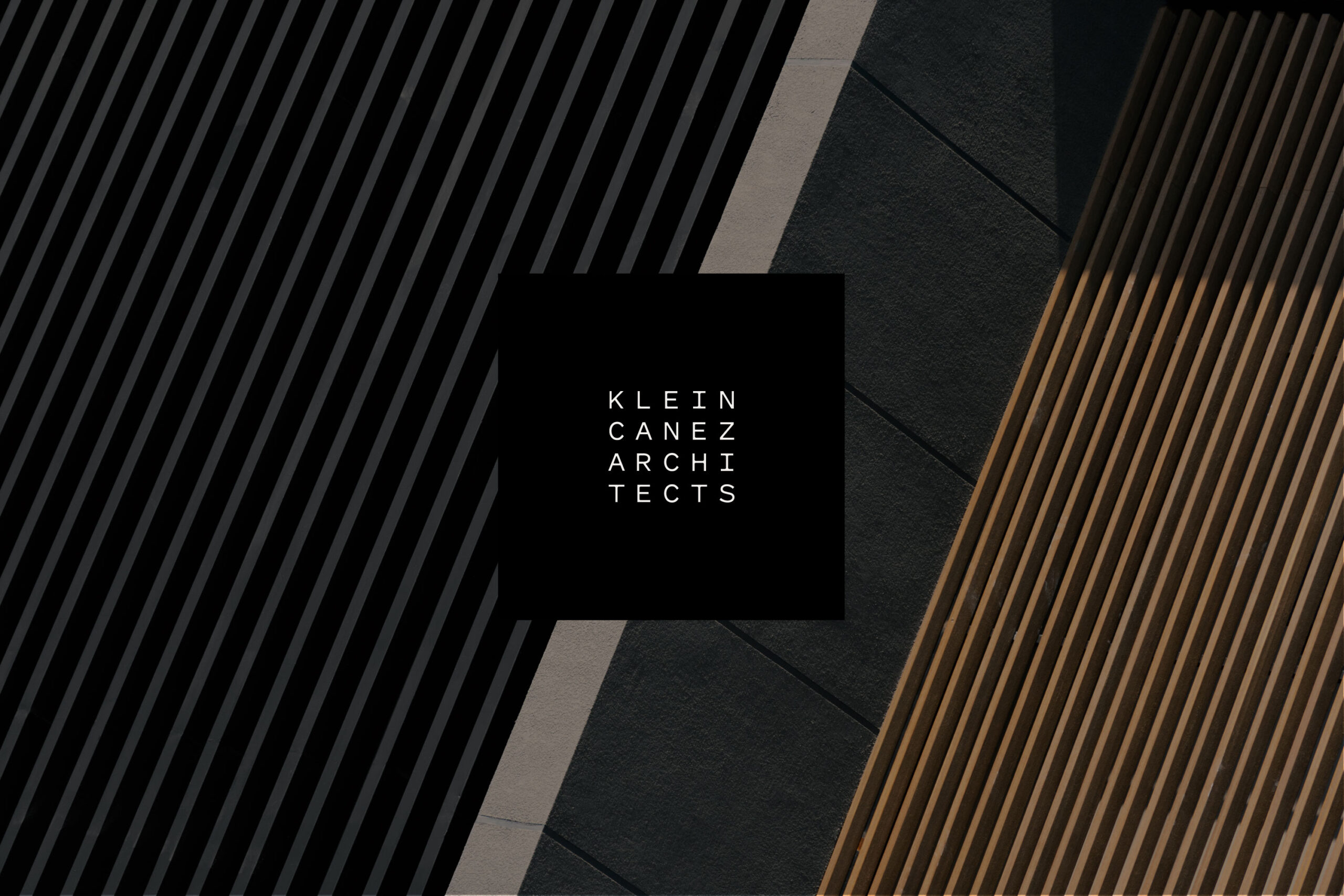
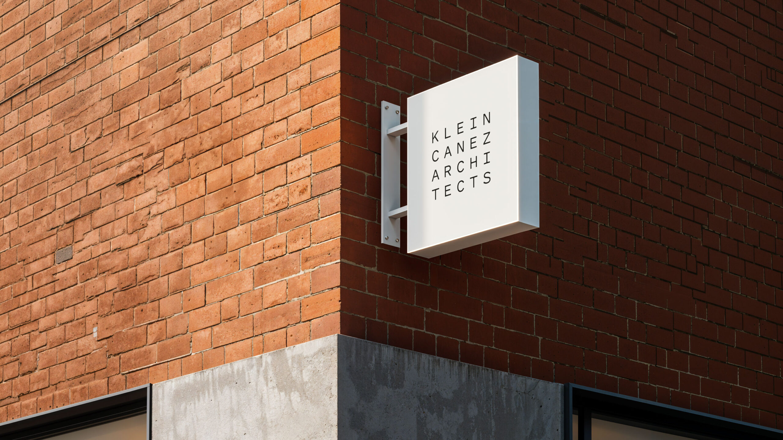
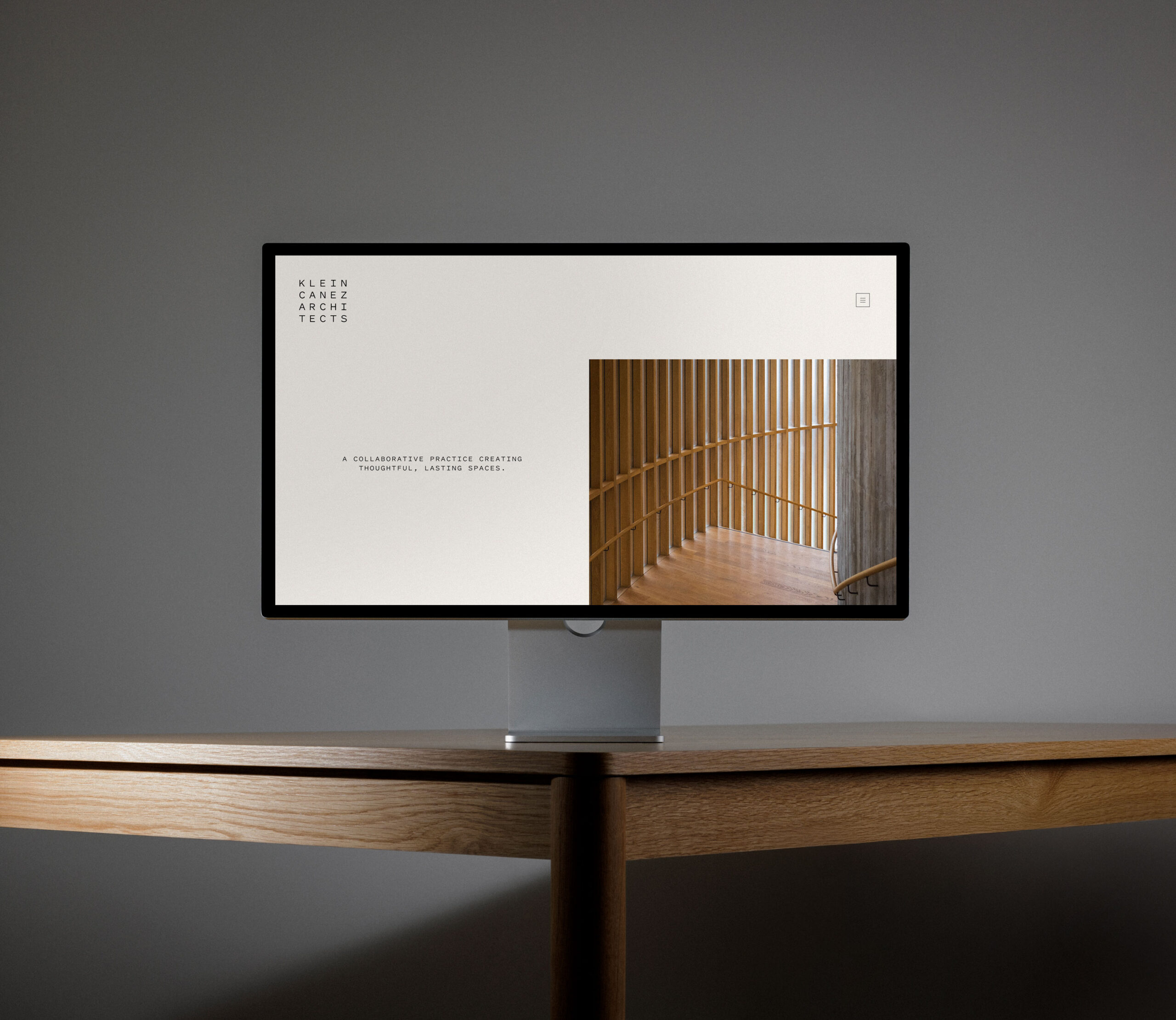
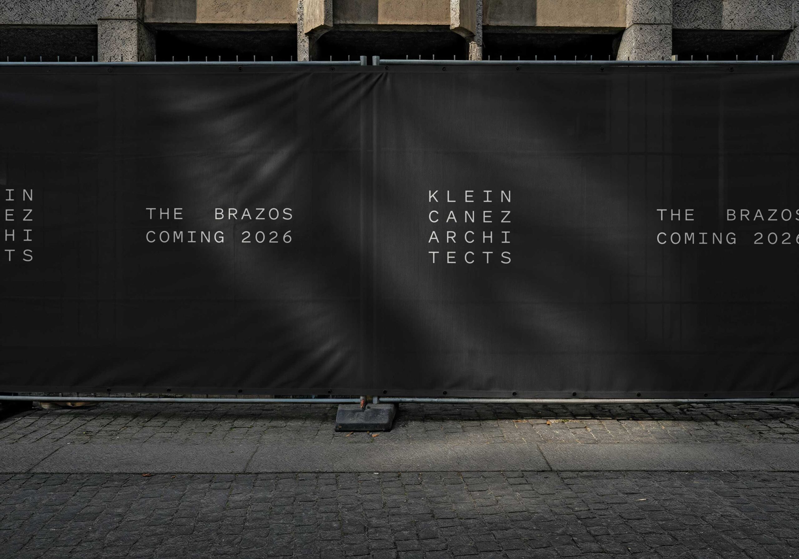
The typographic mark emphasizes slender, legible lines. The composition of the mark is a counterpoint to the type, with a rectilinear grid that spells out the firm’s name across four perfectly balanced rows. Yet, despite its crispness, the mark also invites a playful second look: a sort of puzzle that scrambles the word “architects” into two lines. The brand is elaborated with a neutral color palette: a gesture of understated refinement. Visual treatment of photography is likewise subtle, with editorial black-and-white photography taking center stage. As Klein Canez Architects expands its presence in Houston and beyond, Ummo’s branding sets the tone—without setting limits.


Colophon
Project
Strategy and brand for Klein Canez Architects
Client
Klein Canez Architects
Scope
Typology
Credits
Website development by Alex Knoll